Public Domain art preparation: in color
A quick guide on how to prepare colored public domain images to use in your own publications.
Last time we covered the preparation of monochrome images. Now, let's see what intricacies we will encounter when working with colored ones.
The Source
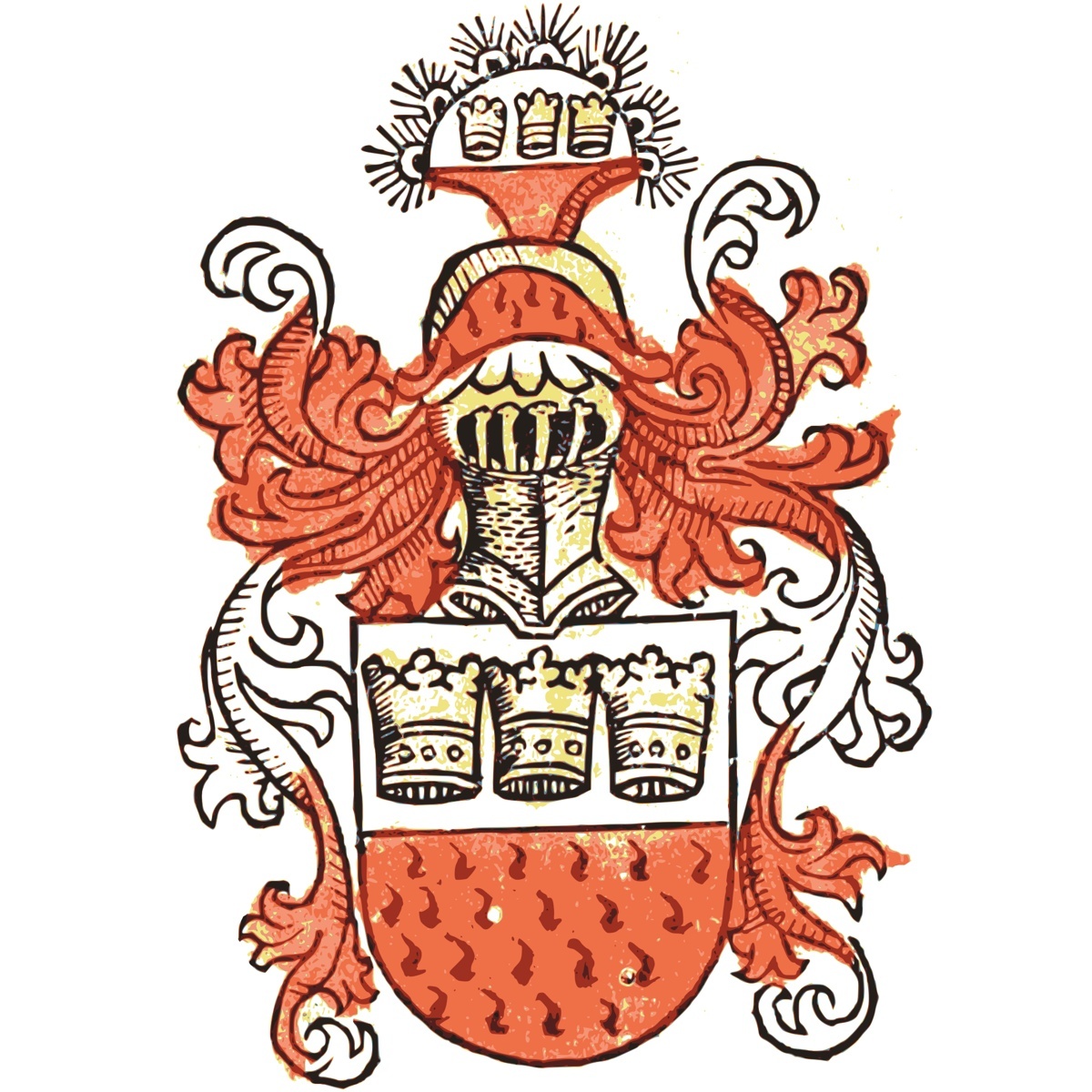
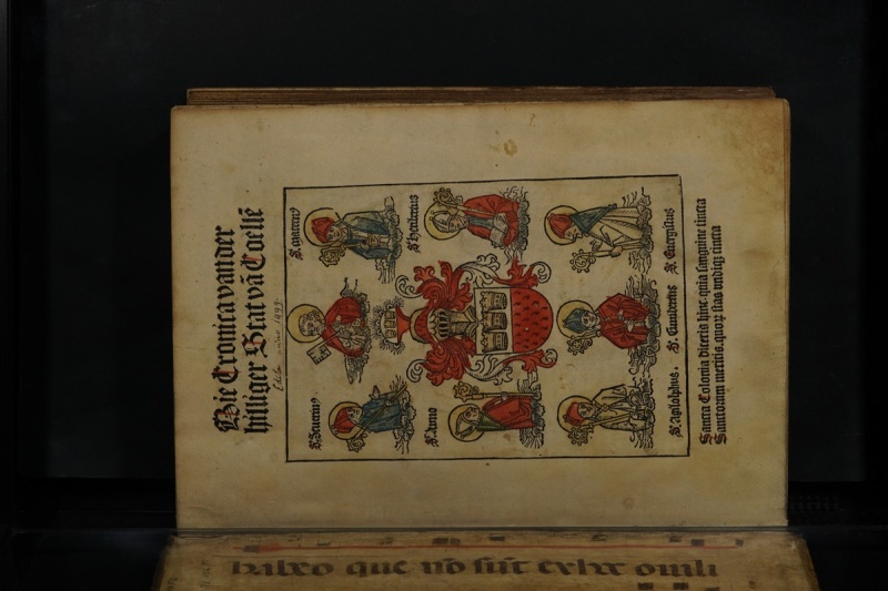
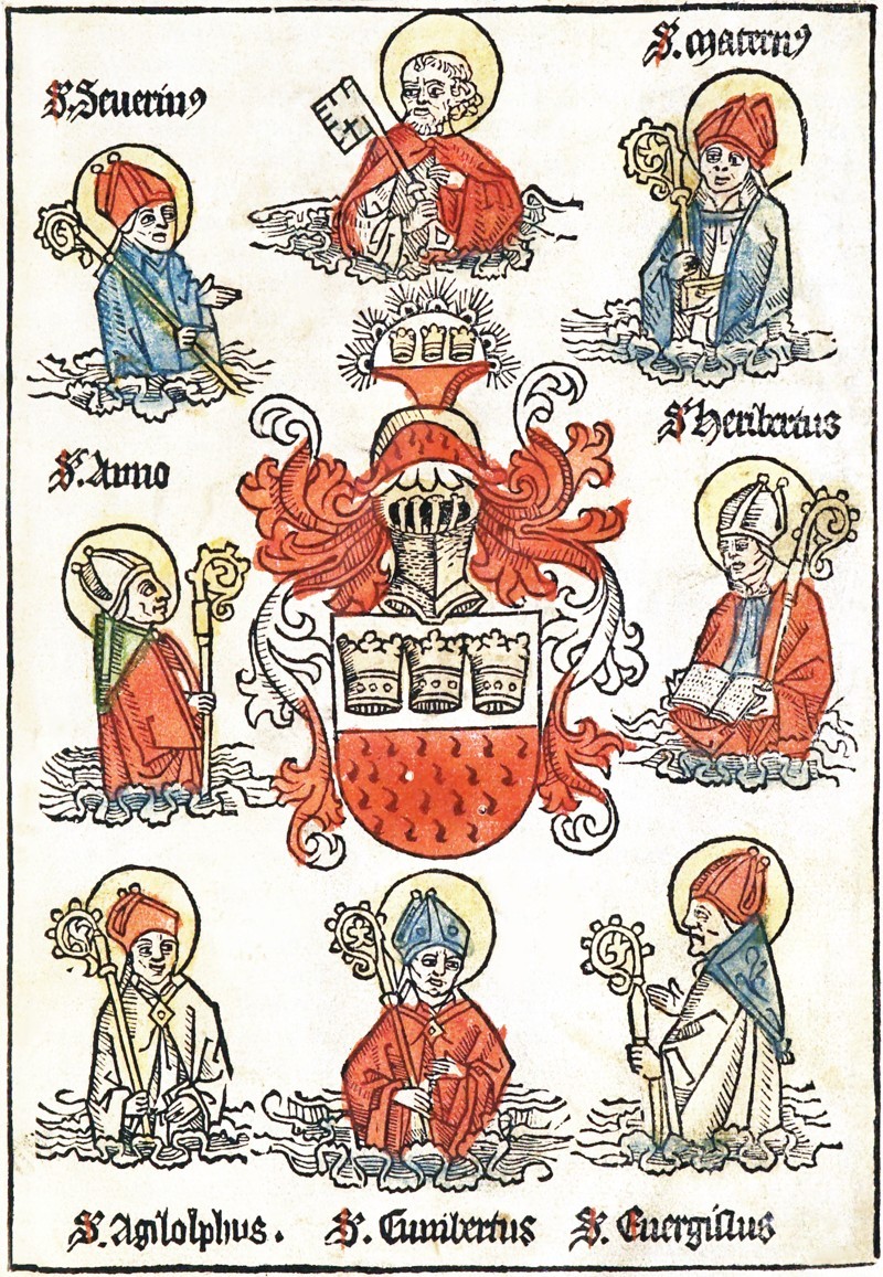
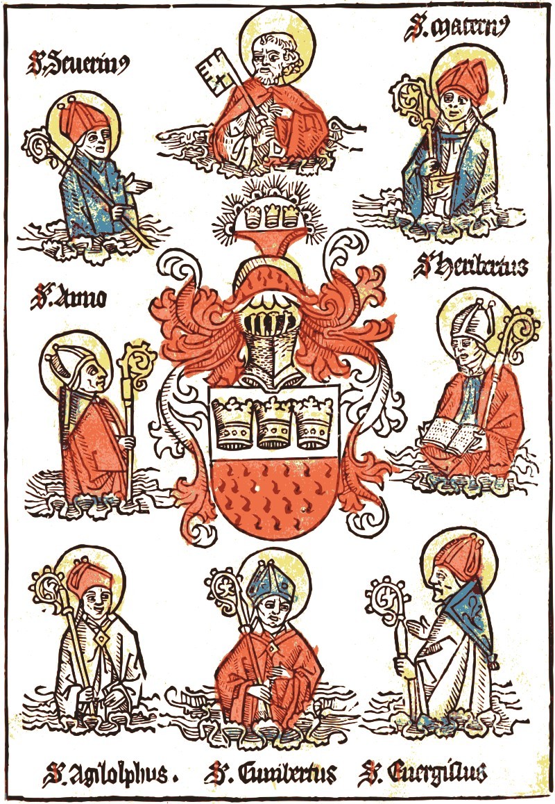
Today our specimen will be the title illustration of Die Cronica van der hilliger Stat va[n] Coelle[n]. As mentioned previously, I recommend downloading the "single page original" or "single page processed" archive.
Levels
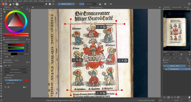
The first thing that needs to be done, is levels adjustment. Open the image in GIMP1 and, after rotating it to the correct orientation (Image → Transform → Rotate 90° clockwise), open the Colors → Levels… window.
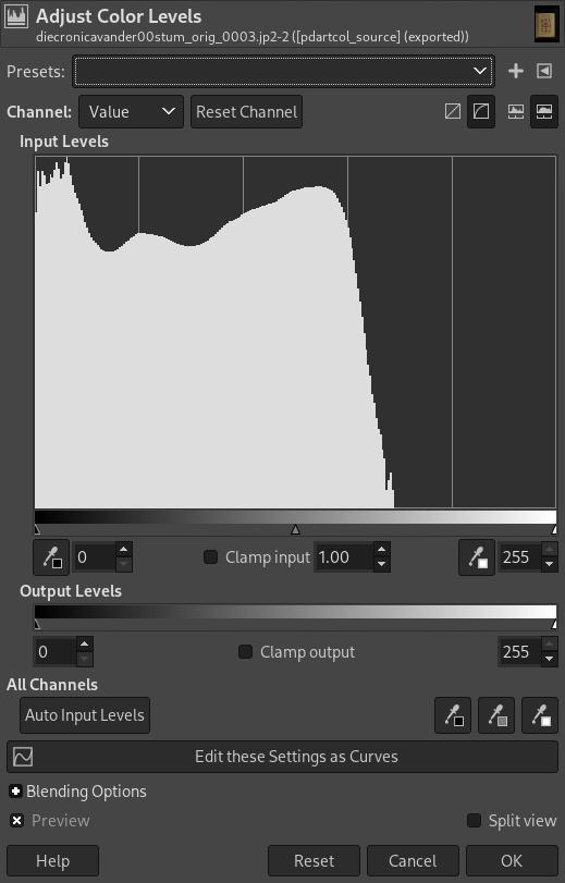
You can either use Auto Input Levels, or pick black, gray, and white points manually, using the three color picker buttons on the same row. I will go with the latter, picking the black point from the blackest ink on the page, the grey point — from the black letters below the image, and the white one — from the lightest area of the page. Try it several times to be sure you are getting the best possible result.
Cleanup
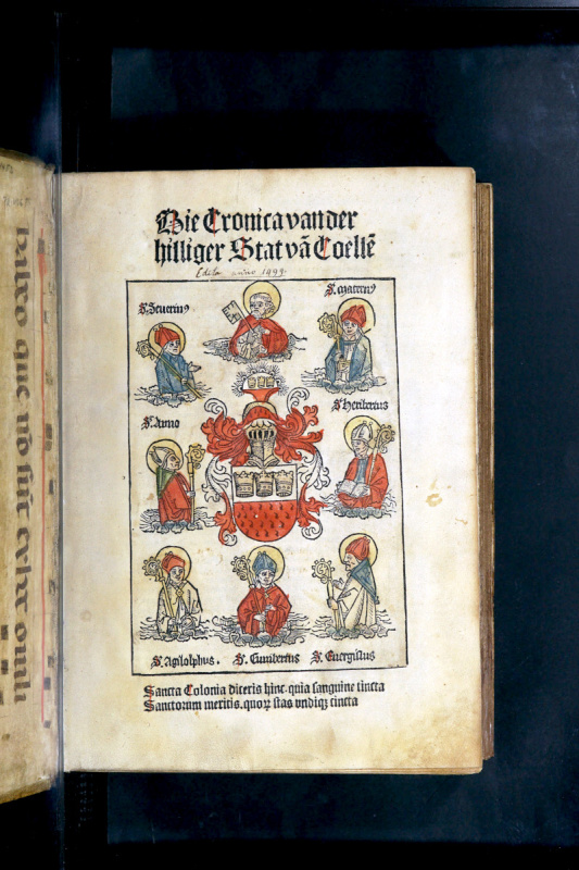
After exporting the file (File → Export As… or Shift+Ctrl+E), open it in Krita.2
Since the image is slightly off the rectangle shape, click on the Assistant Tool and place four Rulers on the edges of the outlined border. Hold Shift to keep them straight.
Then, click on the Transform tool (Ctrl+T) and select the Perspective option. By slightly dragging the corners of the image you can arrange them to rulers' intersections.
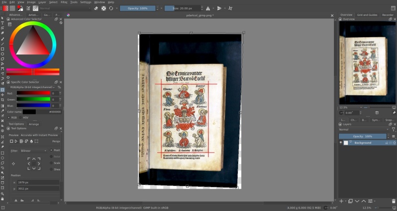
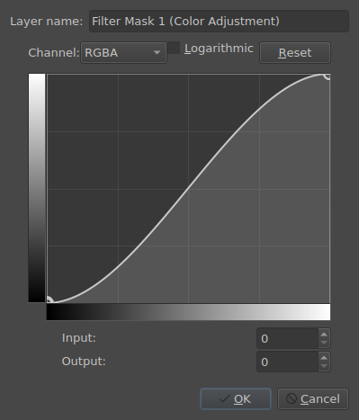
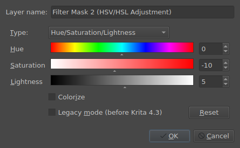
After all that, Crop (C) the page to the image area, right-click on the image layer in the Layers window and Add → Add Filter Mask… these:
Adjust → Color Adjustment
Adjust → HSV/HSL Adjustment (adjust Saturation and Lightness to your liking)
📝 NOTE: Filter layers could also be drawn on in monochrome mode to select what parts of the image they should be applied to: from white (default) to apply the filter fully, to black color to disable the filter over this particular area. In other words, it works the same way as a transparency mask3. One useful trick in that regard, is to apply a black-white gradient (G) matching the page "curve" to equalize the background brightness.
Right-click on the image layer again, and choose New Layer From Visible to create a duplicate of your image with baked-in filters. Choose the Smart Patch Tool4, adjust its size and "patch-out" any imperfections. For the trickiest edits, use the Clone Tool5 brush.
Upscaling
For the raster upscaling, the same that was stated for the monochrome images still stand, so only vectorizing in Inkscape6 will be covered here.
With the image object selected, open the Path → Trace Bitmap… window and go to the Multicolor tab, selecting the Colors Detection Mode. Check the Stack option, and select the required number of Scans (colors). This will depend on the image and you should try a couple of variations to see what works best.
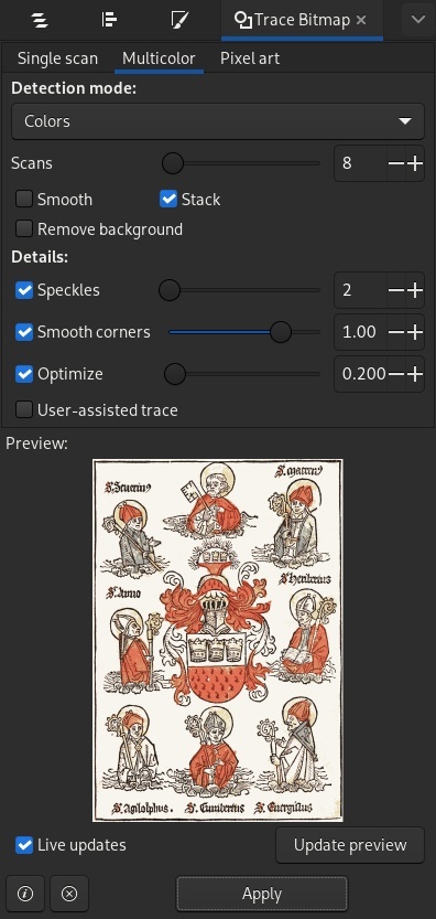
Press the Apply button to generate the vector layers.
You might notice, that colors are not exactly as bright and vibrant as the original. This is easily fixable by selecting a single layer from the group and adjusting the color manually in the Fill and Stroke tab, or color-picking from the original.
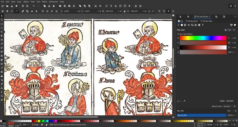
If needed, additional corrections could be made by using Extensions → Color → HSL Adjust….
Discuss this post on Reddit