Creating fonts with Inkscape and FontForge
Ever wanted to create your own cool fonts? Here's a guide how to easily do it using Inkscape1 and FontForge2 — both are free and open source applications.
Contents
Inkscape ↩
Before you start, you might want to set your default units to px. For this, open File → Document Properties… window (Shift+Ctrl+D) and select px in Format and Display units fields.
Optionally, you can also adjust Page and Desk colors.
Setup
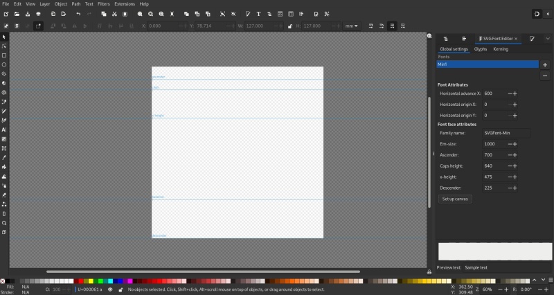
Open Text → SVG Font Editor… window and set up your Global settings:
Horizontal advance X— the default distance to advance before printing the next glyph (in other words, the default glyph width PLUS the default distance between glyphs)Horizontal origin(XandY) — glyph's horizontal origin coordinatesFamily name— the family name of your new fontEm-size— the width ofMcharacter AND width and height of the canvasAscender— the top guide for your highest glyphs (like "b", "f", "l", etc.)Caps height— the capital guide for your capital glyphsx-height— the lowercase guide, usually equal to the height of "x" glyphDescender— the guide below the baseline, for the "tails" of such glyphs as "g", "j", "p", etc.
All numerical values are in pixels. Ascender, Caps height, and x-height are measured from the baseline up, while Descender — from baseline down.
For this particular font I've used these values:
Horizontal advance X= 600Horizontal origin(XandY) = 0, 0Em-size= 1000Ascender= 700Caps height= 640x-height= 475Descender= 225
📝 Note: if you want to create a True Type font later, use powers of 2 for these: so, for example, your Em-size will be "1024" instead.
Now click Set up canvas button, and you are ready!
If you want extra guide lines, just draw a straight line (pressing Ctrl will snap it to an angle) and then perform Object → Objects to guides (Shift+G) operation on it.
Glyphs
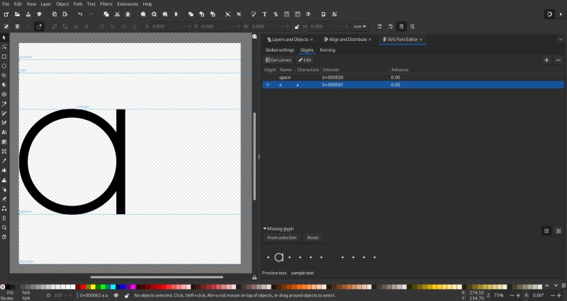
When you are are done with the canvas, switch to the Glyphs tab of the SVG Font Editor. Here you will spend most of the time, creating the glyphs one by one:
- Click
+(Add new glyph) button. - Enter the actual character the new glyph represents into the
Charactersfield. - Enter the same character into the
Namefield. For space glyph (U+000020), use "space" name. - Click
Editbutton: the font editor will create a separate layer for the glyph and hide all other layers. (You can observe this in theLayers and Objectswindow). - Draw the glyph, starting at
X=0coordinate.- Keep in mind that for the font editor only paths matter, so in the end all objects and strokes should be converted to paths by
Path → Object to Path(Shift+Ctrl+C) orPath → Stroke to Path(Ctrl+Alt+C) operations. - I would also recommend to fuse the glyph into a single path by selecting all of its objects and doing
Path → Union(Ctrl++) operation.
- Keep in mind that for the font editor only paths matter, so in the end all objects and strokes should be converted to paths by
- Click
Get Curvesbutton to "load" the glyph. It should now appear in theGlyphfield.
Missing glyph
Also, you can create a "Missing Glyph" to represent any characters the font doesn't have a glyph for. Under the Missing Glyph collapsible panel, you will find two self-explanatory buttons: From selection and Reset. Select the object you want to use and click the first button.
In the screenshot below you can see the "space" and "a" glyphs, as well as a "Missing glyph" represented by a small circle in Preview text panel.
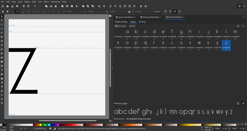
One by one, I've created a whole lowercase set of letters. Of course, for a full fledged font you will also need capitals, numbers, and punctuation marks, as a minimum.
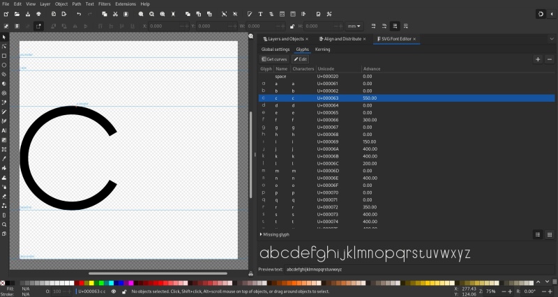
Advance (optional)
You may notice, that some glyphs are spread too wide due to their narrow nature. That's where Advance field comes into play. Since we set Horizontal advance X to 600, the Advance of "0" is actually "600" in this case. If the glyph is 100 pixels wide, you should then set the Advance to "100" instead. Use the Preview text window to check your corrections.
📝 Note: this step might easily be skipped and done later in FontForge in a much easier way.
Ligatures (optional)
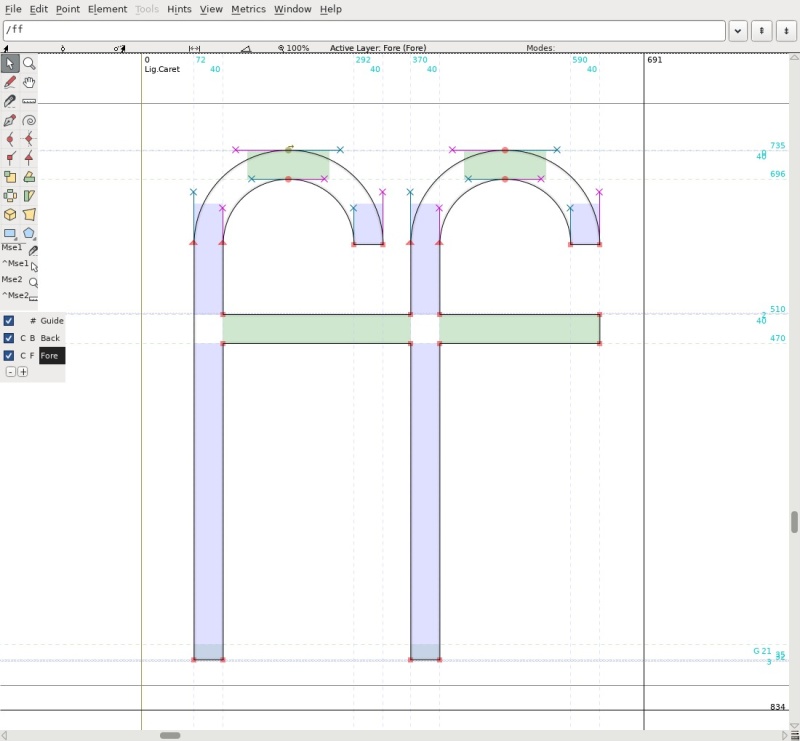
If you want, you could also add some ligatures3 to your new font. Below you can see an "ff" ligature. Both Name and Characters fields will be "ff".
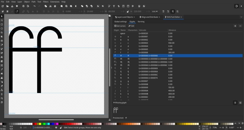
Sadly, Inkscape doesn't seem to be able to show the ligature Glyph correctly when you click Get curves button, but nevertheless ligatures are saved into the font and will display correctly in FontForge later.
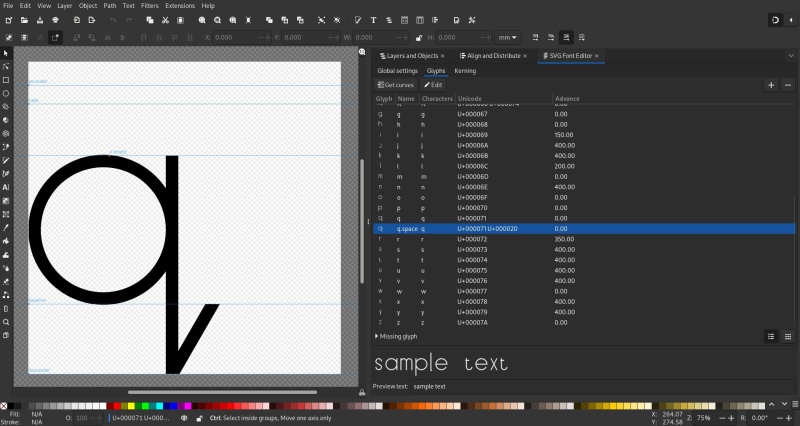
Another kind of special glyph forms could be a glyph at the end of a word. Let's create a second "q" glyph and add a tail to it. Its Name will be "q.space", and Characters — "q ".
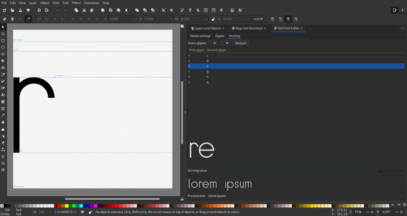
Kerning (optional)
Even after adjusting Advance value, some of the glyph combinations could still look too spaced. That's what Kerning tab is for. You can add glyph pairs and reduce the distance between them manually.
The process is pretty tedious and it seems you cannot do it for the ligatures. Thus, just like with the Advance previously, I will recommend to do this step later in FontForge instead.
FontForge ↩
From this point, all operations will be done in FontForge2. Just open your SVG file there and, if previous steps were done correctly, you will see your glyphs in a font table.
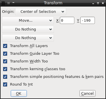
Transform (optional)
You might note that glyphs are positioned too high in their cells. It is easily fixable. Press Ctrl+A to select all glyphs, and open Element → Transformation → Transform… window (Ctrl+⧵) and set the offset for all glyphs. For my font, the correct vertical offset value happens to be "-190".
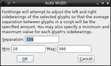
Auto Width
Next, while still having all glyphs selected, perform Metrics → Auto Width… (Ctrl+Shift+W) operation. As you can see, this is much easier to do than manually setting Advance fields in Inkscape. Of course, you can adjust specific glyphs' widths afterwards as well.
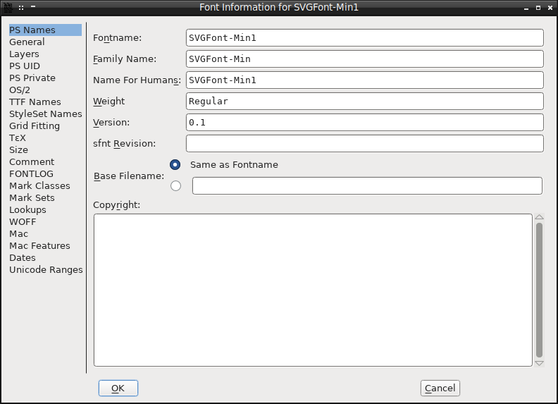
Finally, fill out the info page of the font in Element → Font Info….
I'll leave exploration of the other tabs of the Font Information window for you to do on your own.
Hinting
Select all glyphs and perform Hints → AutoHint (Ctrl+Shift+H) to set up hinting.4
Ligatures (optional)
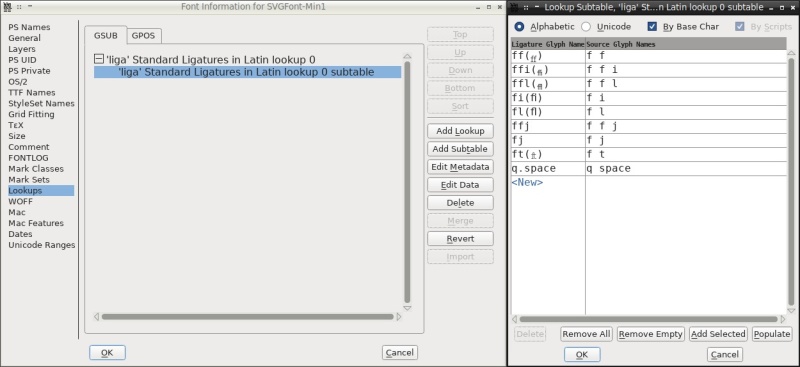
To set up your ligatures, open Element → Font info… → Lookups window. If you created some ligatures previously, you will see a GSUB subtable you can open by clicking the Edit Data button. In my case, all ligatures were already configured automatically.
📝 Note: Strictly speaking, using ligature lookup table for out q.space character is not correct, while it works nevertheless. After all, it will only trigger for the "q space" pair of characters. The correct way to implement this kind of substitution will be a contextual chaining lookup. To learn more about contextual lookup tables, see these articles:
- https://fontforge.org/docs/ui/dialogs/contextchain.html
- https://www.fonttutorials.com/how-to-chained-contextual-ligatures/
- https://graphicdesign.stackexchange.com/questions/94692/creating-final-forms-with-fontforge
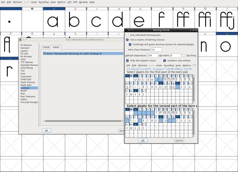
Kerning
Switching to GPOS tab, you will see a kerning subtable, if you set up some custom Kerning previously. Now you can see that Inkscape way of kerning is very imprecise and inconvenient.
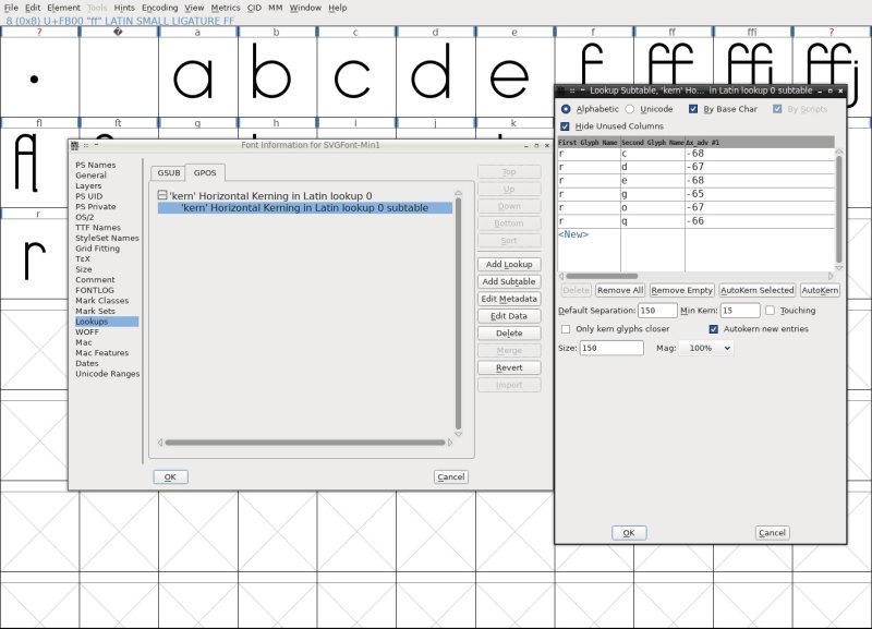
The good thing is, there's a much better way to do it in FontForge. Delete the kerning subtable and create a new one and switch to the Use a matrix of kerning classes option. Select some glyphs you feel are in need of kerning.
If you kept FontForge will guess kerning classes for selected glyphs option checked, you will see something like this.
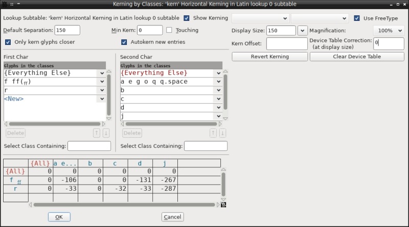
You can delete and add (by clicking a dropdown button) new list items easily. Now you can set kerning and see the results in the class matrix below and the preview panel to the right.
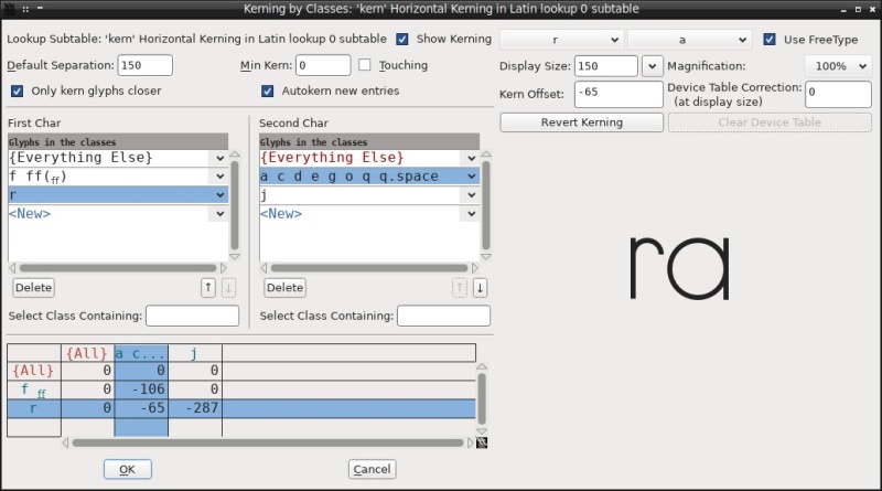
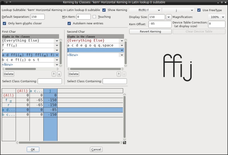
After some experimentation, here's how my kerning matrix looks like.
Metrics
To test your font, open a Metrics → New Metrics Window. Here, you can type any text and see if ligatures and kerning are applied correctly.
Editing
By that point you might notice that you can also edit glyphs in FontForge as well. But it's not as intuitive as using Inkscape. Nevertheless, it might come up handy for some minor edits and updates.
New Glyphs
Now, if you want to add new glyphs to your font later, you can just create them in the original SVG font file, and then click Element → Merge Fonts… to append them to your FontForge SFD file. When asked about kerning, click Yes, and don't forget to perform the Transform, Auto Width, Hinting, Kerning, etc. afterwards.
Validation
To find some potential problems with your font, use Element → Validation menu.
For this font, I've stumbled upon these:
- Non-integral Coordinates (corrected by
Element → Round → To Int(Ctrl+Shift+_)) - Wrong Direction (corrected by
Element → Correct Direction(Ctrl+Shift+D)) - Missing Points at Extrema (corrected by
Element → Add Extrema(Ctrl+Shift+X)) - Self Intersecting (corrected by
Element → Overlap → Remove Overlap(Ctrl+Shift+O)) - Missing BlueValues entry (corrected by going to
Element → Font Info… → PS Privateand adding a newBlueValuesentry)
All of these could also be fixed through a context menu in the Validation window.
Generate
Finally, you will need to generate font files: File → Generate Fonts… (Ctrl+Shift+G). The Open Type font will suffice in our case.
This concludes the guide. To learn more about FontForge, check out the official tutorial.5
Discuss this post on Reddit